

 Plot your results
Plot over X11
Plot from overview
To plot over X11, make sure you are connected with ssh -X user@login2.barnard.hpc.tu-dresden.de (of course, use the HPC system you wish instead of barnard, if applicable, and change it to your user). Then, cd into your OmniOpt2 directory. Assuming you have already ran an OmniOpt2-run and the results are in runs/my_experiment/0 (adapt this to your experiment folder!), run this:omniopt_plot runs/my_experiment/0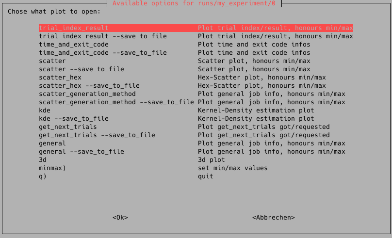
Use your arrow keys to navigate to the plot type you like, and then press enter.
Plot directly
If you know what plot you want, you can directly plot it by using:omniopt_plot runs/my_experiment/0 scatter # change plot_type accordinglyPlot to file
All plot scripts support to export your plot to a file.omniopt_plot runs/my_experiment/0 scatter --save_to_file filename.svg # change plot_type and file name accordingly. Allowed are svg and png.Plot types
There are many different plot types, some of which can only be shown on jobs that ran on Taurus, or jobs with more than a specific number of results or parameters. If you run the omniopt_plot-script, it will automatically show you plots that are readily available.
CPU/RAM Usage
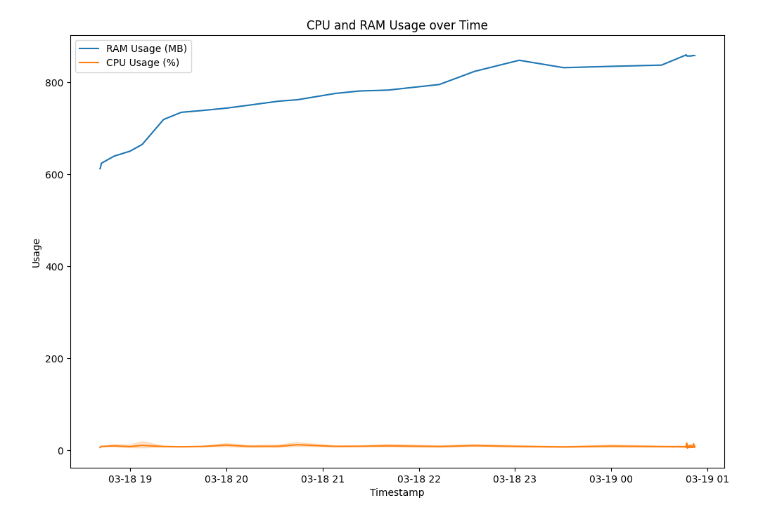
omniopt_plot runs/my_experiment/0 cpu_ram_usagePlot CPU and RAM Usage over time for the main worker
No arguments found.
General Job Infos
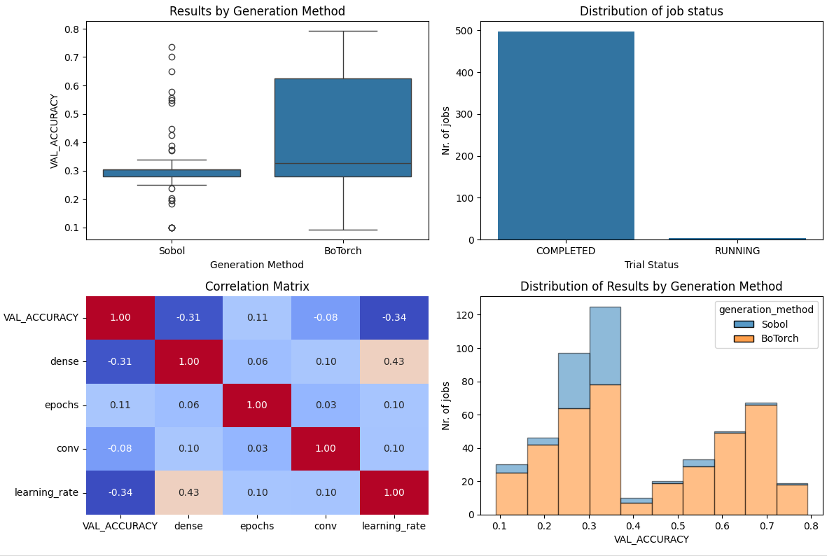
omniopt_plot runs/my_experiment/0 generalThe general-plot shows you general info about your job. It consists of four subgraphs:
- Results by Generation Method: This shows the different generation methods, SOBOL meaning random step, and BoTorch being the model that is executed after the first random steps. The y-value is the Result. Most values are inside the blue box, little dots outside are considered outliers. Usually, you can see that the nonrandom model has far better results than the first random evaluations.
- Distribution of job status: How many jobs were run and in which status they were. Different status include:
- COMPLETED: That means the job has completed and has a result
- ABANDONED: That means the job has been started, but, for example, due to timeout errors, the job was not able to finish with results
- MANUAL: That means the job has been imported from a previous run
- FAILED: That means the job has started, but it failed and gained no result
- Correlation Matrix: Shows you how each of the parameters correlates with each other and the final result. The higher the values, the more likely there's a correlation
- Distribution of Results by Generation Method: This puts different results into so-called bins, i.e. groups of results in a certain range, and plots colored bar charts that tell you where how many results have been found by which method.
No arguments found.
Plot GPU usage over time on different hosts
omniopt_plot runs/my_experiment/0 gpu_usageShows the workload of different GPUs on all nodes that jobs of an evaluation has run on over time.

No arguments found.
Kernel-Density-Estimation-Plots (KDE)
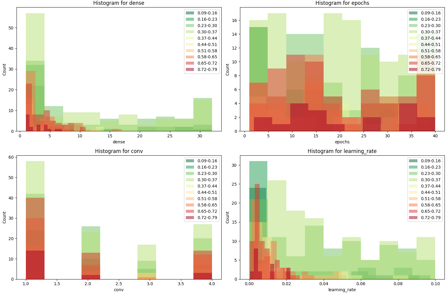
omniopt_plot runs/my_experiment/0 kdeKernel-Density-Estimation-Plots, short KDE-Plots, group different runs into so-called bins by their result range and parameter range.
Each grouped result gets a color, green means lower, red means higher, and is plotted as overlaying bar charts.
These graphs thus show you, which parameter range yields which results, and how many of them have been tried, and how 'good' they were, i.e. closer to the minimum (green).
No arguments found.
Scatter-2d
omniopt_plot runs/my_experiment/0 scatterThe scatter plot shows you all 2d combinations of the hyperparameter space and, for each evaluation, a dot is printed. The color of the dot depends on the result value of this specific run. The lower, the greener, and the higher, the more red they are. Thus, you can see how many results were attained and how they were, and where they have been searched.
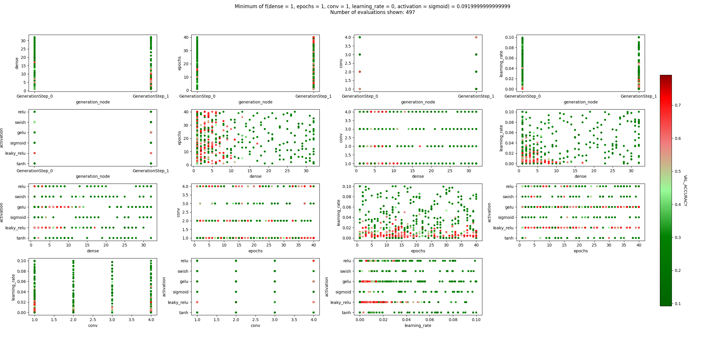
No arguments found.
Scatter-Generation-Method
omniopt_plot runs/my_experiment/0 scatter_generation_methodThis is similar to the scatter plot, but also shows you which generation method (i.e. SOBOL, BoTorch, ...) is responsible for creating that point, and how the generation methods are scattered over each axis of the hyperparameter optimization problem. Thus, you can see how many runs have been tried and where exactly.
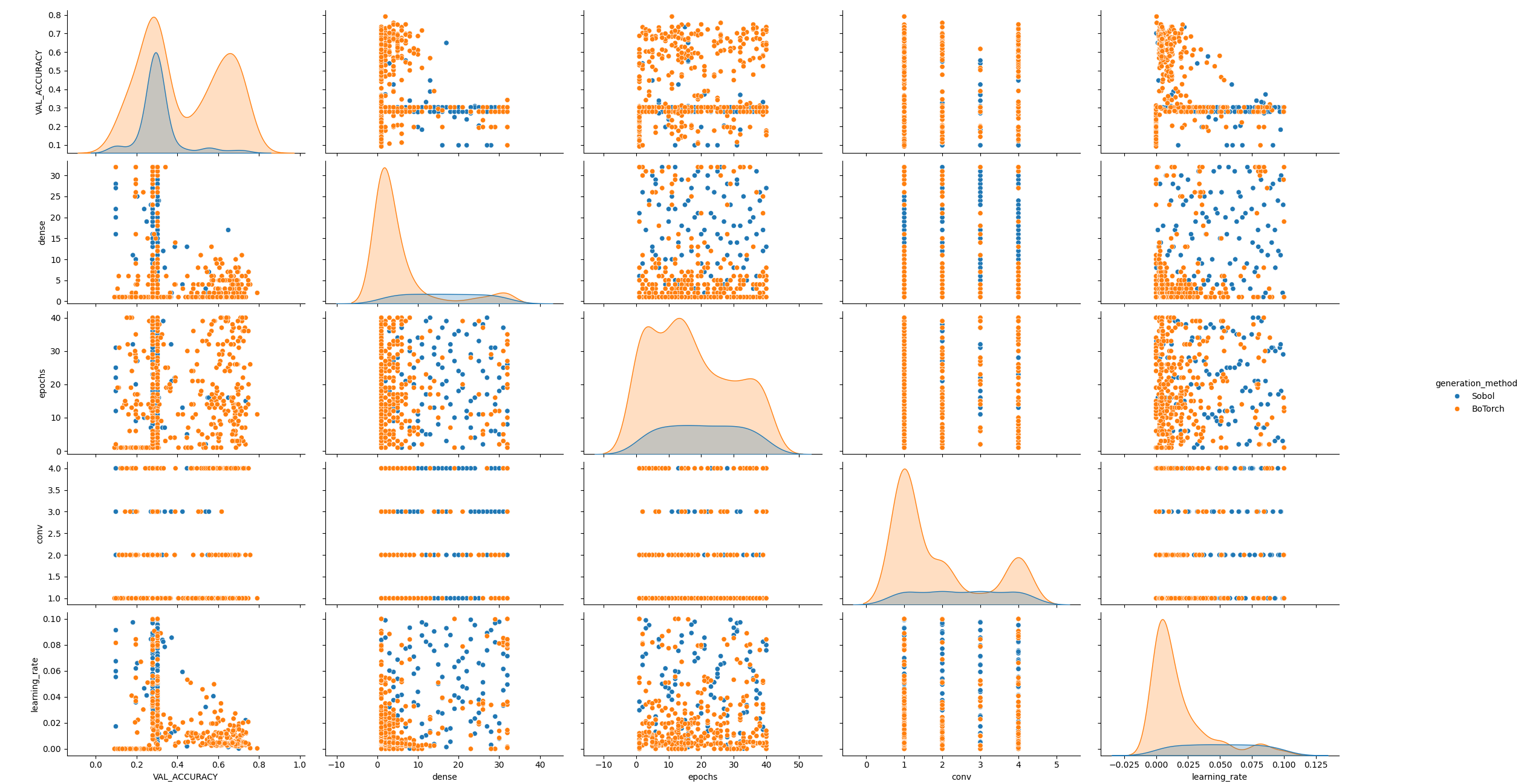
No arguments found.
Hex-Scatter plot
omniopt_plot runs/my_experiment/0 scatter_hexSimilar to scatter plot, but here many runs are grouped into hexagonal subspaces of the parameter combinations, and the groups are coloured by their average result, and as such you can see an approximation of the function space. This allows you to quickly grasp 'good' areas of your hyperparameter space.
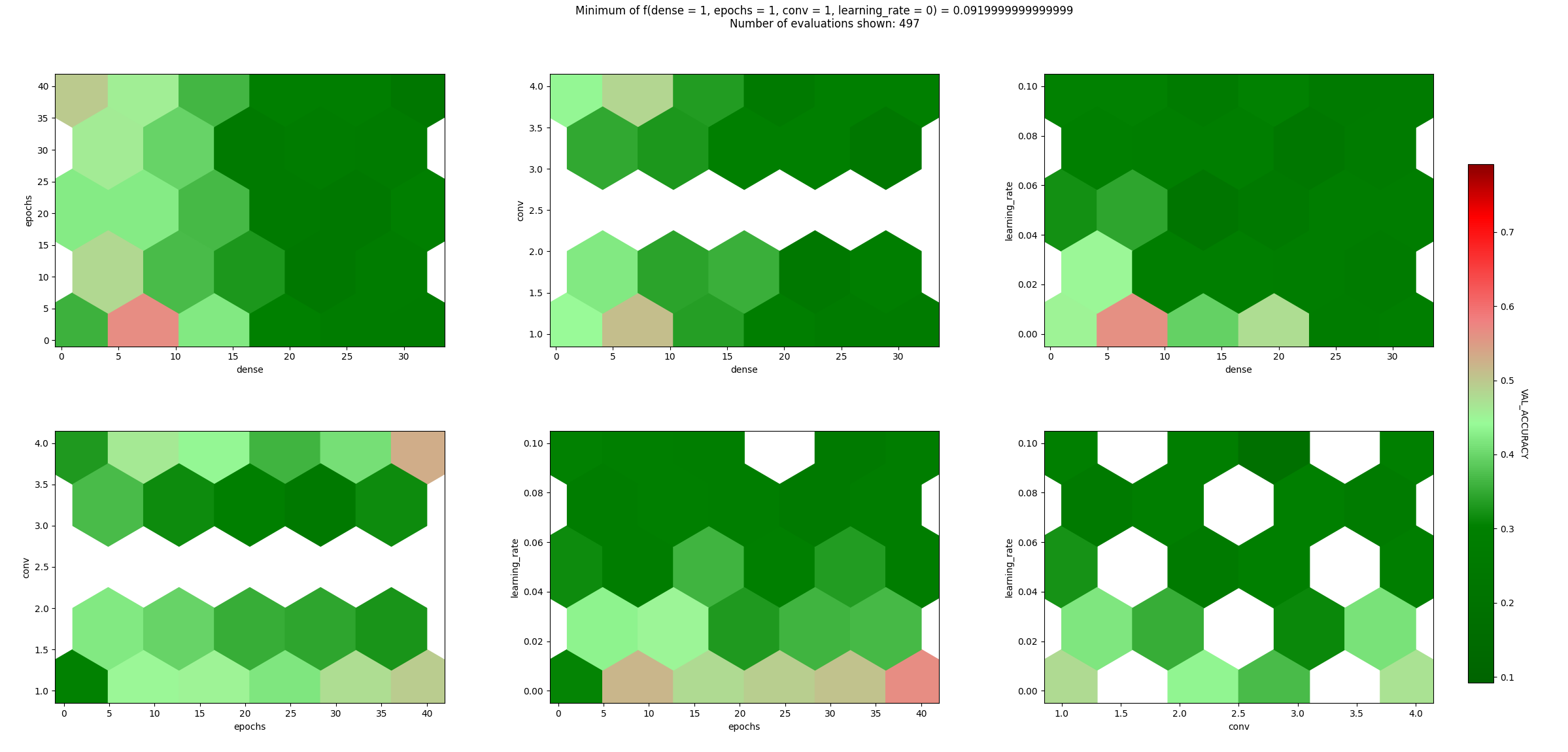
No arguments found.
Plot time and exit code infos
omniopt_plot runs/my_experiment/0 time_and_exit_codeThis graph has 4 subgraphs that show different information regarding the job runtime, it's results and it's exit codes.
- Distribution of Run Time: This shows you how many jobs had which runtime. The y-Axis shows you the number of jobs in one specific time-bin, while the x-axis shows you the number of seconds that the jobs in those bins ran.
- Result over Time: This shows you a distribution of results and when they were started and the results attained, so you can find out how long jobs took and how well their results were.
- Run Time Distribution by Exit Code: Every job as an exit code and a run time and this shows you a violin plot of the runtimes and exit-code distribution of a job. It may be helpful when larger jobs fail to find out how long they need until they fail.
- Run Time by Hostname: Shows a boxplot of runtime by each hostname where it ran on. Useful to detect nodes that may execute code slower than other codes or to find out which nodes larger models were scheduled to.
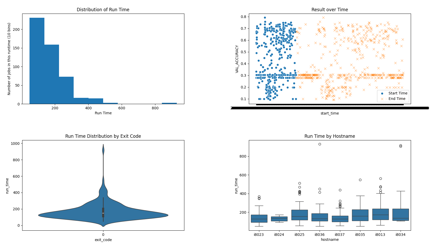
No arguments found.
Plot trial index/result
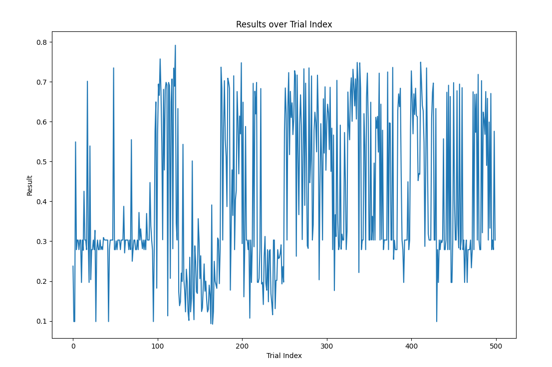
omniopt_plot runs/my_experiment/0 trial_index_resultThe trial-index is a continuous number that, for each run that is completed, is increased. Using it as x-axis allows you to trace how the results developed over time. Usually, the result should go down (at minimization runs) over time, though it may spike out a bit.
No arguments found.
Plot number of workers over time
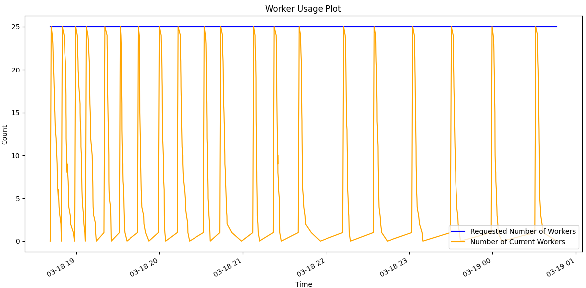
omniopt_plot runs/my_experiment/0 workerShows the amount of requested workers, and the amount of real workers over time.
No arguments found.